


Vivo’s latest OriginOS 6 platform looks like it was designed by someone who had iOS 26 open on the next screen. From the rounded icons and frosted overlays to the glass-like dock and depth-shifting wallpapers, the resemblance is uncanny. The company is clearly borrowing Apple’s Liquid Glass aesthetic, a design language that received backlash after release due to usability issues.
Vivo’s new OriginOS 6 heavily borrows Apple’s Liquid Glass design, with identical transparency effects, icons, and interface depth
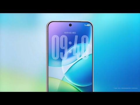
Vivo’s presentation of OriginOS 6 emphasized “flow” and “effortless motion,” focusing on fluidity and integration rather than stark redesigns. The similarities, however, are difficult to ignore as they stretch across almost all aspects of the operating system, especially the Lock Screen. It appears that Apple’s design philosophy is influencing the broader industry once again.
The Most Noticeable Similarities
It has been less than a month since iOS 26 was made public, and companies have already started implementing their own versions of the Liquid Glass redesign. Here’s a closer look at the design cues OriginOS 6 appears to have taken directly from iOS 26:
- Translucent Panels and Frosted Overlays: OriginOS 6 uses the same semi-translucent blur Apple uses throughout iOS 26 across notifications, widgets, and menus.
- Rounded App Icons and Buttons: The soft-corner design, which is now a hallmark of Apple’s interface, has been nearly mirrored in Vivo’s latest icons.
- Floating Dock and Layered Depth: Similar to iOS 26, OriginOS 6 uses a hovering dock and stacked UI layers that cast subtle depth shadows for a glass-like illusion.
- Dynamic Wallpapers With Light Refraction: Both systems use animated wallpapers that react to lighting and motion, giving the display a sense of visual fluidity.
- Unified Control Center Layout: Vivo’s redesigned quick toggles and sliders resemble Apple’s Control Center, down to spacing, translucency, and color gradients.
- Lock Screen and Customization: The Lock Screen looks visually identical to iOS 26, and Vivo has also gone a step further to keep the customizations the same.
Copycats or Competitive Strategy?
Drawing inspiration in the smartphone industry is not something we haven’t seen before, as companies tend to borrow and refine each other’s ideas regularly. On the flip side, the level of similarities between iOS 26 and OriginOS 6 goes beyond surface resemblance. It raises the question of whether this is a natural convergence of design trends or a deliberate attempt to capitalize on Apple’s new visual appeal.
For Vivo, this could be a strategic decision, as the new design language could change the perceived quality of the device. However, there is always a risk of being viewed as lacking originality if the changes do not come with meaningful innovation beneath the surface.
Has Vivo’s embrace of Apple’s Liquid Glass design started a major shift in the smartphone industry’s visual identity?


About the author: Ali Salman is a technology reporter for Wccftech mobile section with a specialized focus on Apple and the intellectual property that drives mobile innovation. He has cultivated a unique expertise in analyzing and deconstructing complex technology patents, translating dense legal and technical documents into clear, insightful reports on future products.
Follow Wccftech on Google to get more of our news coverage in your feeds.


